Introduction
Grown Brilliance, is a online retailer, that sells labgrown Jewelry. As e-commerce continues to thrive, ensuring an intuitive and user-friendly navigation experience becomes paramount.
Problem
Grown Brilliance, an online retailer specializing in lab-grown diamond jewelry, faces significant usability issues across its entire website, particularly in navigation and the listing page design. The current website structure lacks intuitiveness, resulting in user frustration and high drop-off rates during product discovery. Moreover, the listing page suffers from poor contrast, overcrowded layout, and unclear text hierarchy, leading to low engagement and conversion rates.
Solution
To address these usability challenges comprehensively, Grown Brilliance will undergo a full website redesign coupled with a thorough UX/UI study. This initiative aims to overhaul the website’s navigation system to improve user flow and streamline product discovery. Additionally, the listing page will be redesigned with a focus on enhancing contrast, readability, and visual hierarchy to boost engagement and conversion rates. Through meticulous UX/UI research, wireframing, prototyping, and iterative testing, Grown Brilliance seeks to create a modern, user-centric website that offers a seamless and enjoyable shopping experience for its customers.
Project Details
Grown Brilliance, is a online retailer, that sells Lab grown diamond Jewelry. As e-commerce continues to thrive, ensuring an intuitive and user-friendly navigation experience becomes paramount. This case study delves into the redesign process for Grown Brilliance navigation system to enhance user experience (UX) and drive conversion rates.
Role
UX/UI Designer
Process
0.1. Discovery
0.2. Ideation
0.3. Design
0.4. Reflection
Duration
3 Weeks
0.1. Discovery
Initial Analysis
Initial analytics revealed that the existing navigation structure was convoluted, causing frustration and hindering users from finding desired products efficiently. We observed a significant drop-off rate at various stages of the customer journey, particularly during product discovery and exploration.
Consequently, Grown Brilliance decided to embark on a redesign journey focused on improving navigation to enhance overall user experience.
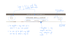
Navigation Bar Analysis
After the Initial Analysis, I started working on the deep analysis for the navigation.
Discovery Session
Logo & Branding:
1. Ensure consistency in branding elements, including logo usage, throughout the website to reinforce brand identity and enhance recognition.
2. Verify that the logo appears only once and maintains consistent branding across all pages to avoid confusion and maintain a cohesive visual identity.
Search Functionality:
1. Rectify non-functional search icons to ensure users can easily initiate searches, enhancing usability and convenience.
2. Consolidate multiple searches into a single prominent location to streamline the search experience and avoid redundancy.
Icon Consistency:
1. Align icons in a single line to create visual harmony and improve overall aesthetic appeal, fostering a sense of order and consistency.
2. Standardize icon design and placement across the website for a cohesive and professional look, enhancing usability and visual appeal.
Navigation Enhancement:
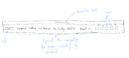
1. Expand the navigation menu to display a comprehensive list of categories, ensuring users can easily access all relevant sections without feeling overwhelmed or constrained.
2. Optimize navigation layout to provide sufficient spacing between categories, facilitating effortless navigation and improving user experience.
Font Contrast & Legibility:
1. Increase font contrast by selecting darker colors to improve readability and accessibility, enhancing user experience for all visitors, including those with visual impairments.
Engagement:
1. Reevaluate category organization to ensure coherence and relevance, preventing confusion and facilitating intuitive browsing experiences.
2. Use high-quality, clear images throughout the website to enhance visual appeal and provide users with accurate representations of products and categories.
Naming Convention & Information Presentation:
1. Streamline naming conventions to avoid redundancy and confusion, ensuring clear and concise labeling for improved navigation and user understanding.
2. Elevate the visibility of important features by placing them prominently within the layout, allowing users to easily identify and interact with key functionalities.
Collection Naming & Visual Clarity:
1. Utilize user-friendly collection names that resonate with the target audience and facilitate intuitive navigation, enhancing overall usability and user satisfaction.
2. Replace blurry images with high-resolution alternatives to ensure clear and distinct visual representations, aiding users in understanding and navigating through different categories.
Sticky Navigation & Diamond Shapes:
1. Implement a sticky navigation bar for easy access to menu options as users scroll through the website, enhancing navigation convenience and efficiency.
2. Incorporate clear and distinguishable images of diamond shapes in the navigation menu to aid users in identifying and selecting desired options effectively.
Clickable Images & Descriptive Text:
1. Ensure all clickable images are properly linked and accompanied by descriptive text to provide users with context and guidance, improving navigation clarity and usability.
Design Solution
- Unified Branding: Standardize logo placement and branding elements across the website to ensure consistency and reinforce brand identity.
Streamlined Navigation: Consolidate multiple search bars into a single prominent location and expand the navigation menu to display all relevant categories, improving usability and navigation efficiency. - Enhanced Visual Clarity: Upgrade font contrast for better readability, replace blurry images with high-resolution alternatives, and ensure clear, clickable elements with descriptive text to improve user engagement and comprehension.
- Sticky Navigation & Diamond Representation: Implement a sticky navigation bar for easy access to menu options while scrolling, and include clear images of diamond shapes in the navigation menu with descriptive labels to aid user understanding and navigation.
0.2. Ideation
Brainstorm
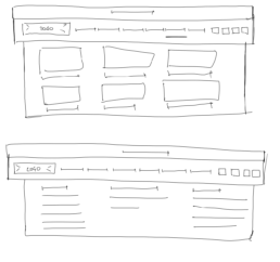
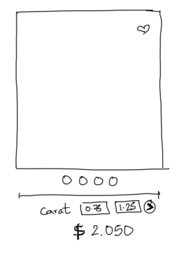
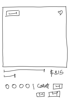
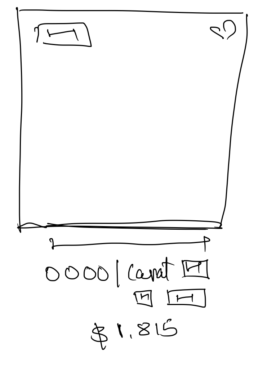
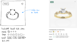
With all the stakeholders, we brainstormed and created wireframes for product tile options. Further created Designs to see which one works the best.
Sitemap
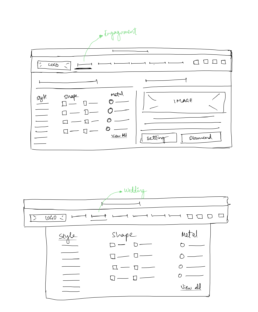
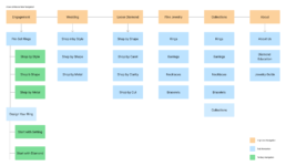
Brainstormed and created a new sitemap so that all categories can be visible rather than the user searching for them. This navigation structure also helps in showing more categories than what was shown before.
0.3. Design
Branding
The design team designed a logo for the brand.
Low-fidelity Wireframes
After confirming the navigation tabs, functions, and sketched ideas, I worked on lo-fi wireframes.
Final Designs
After confirming the lo-fi wireframes I started working on the final designs. These designs were then sent to the dev team for development.
0.4. Takeaways
Result
1. Improved User Engagement: The simplified navigation hierarchy and enhanced filtering options led to a 4.4% increase in average engagement time in 1 month, measured by the average time spent on the website.
2. Higher Conversion Rates: The streamlined navigation contributed to a 100% increase in conversion rates, indicating improved product discoverability and user satisfaction.
Conclusion
Through a user-centric approach and iterative design process, Grown Brilliance successfully transformed its e-commerce website’s navigation system, resulting in improved user experience, higher engagement, and increased conversion rates. Continuous monitoring and iteration will remain crucial to adapt to evolving user needs and market trends, ensuring sustained success in the competitive e-commerce landscape.
Old Vs New


0.1. Discovery
Initial Analysis
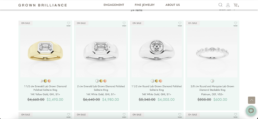
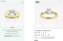
Upon initial analysis of the listing page, it is evident that there is a significant issue with contrast. The product tiles feature a green background, while the product images are set against a grey background, resulting in poor visibility.
Additionally, the grey text fails to stand out effectively. The abundance of text beneath each product tile contributes to a crowded layout with no discernible text hierarchy, further impeding readability.
Product Tile Analysis
Upon receiving stakeholder feedback and concerns, I started working on the enhancing the user experience of the product listing page by addressing issues related to visibility, comprehension, and consistency.
UX Recommendations
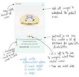
- Increase the visibility of product tags by darkening their color to ensure easy readability.
- Implement alt images for products to provide users with alternative views and enhance their understanding of the product.
- Enhance contrast throughout the page to improve legibility, particularly for text elements, facilitating easier reading.
- Clarify text and option hierarchy below product images to enhance comprehension and streamline user interaction.
- Provide clear labels or tooltips for visual elements like colorful circles to convey their meaning and purpose effectively.
- Introduce additional customizing options such as Carat weight and Shape directly within the product tile for increased user convenience.
- Shorten product descriptions to prevent wrapping onto multiple lines, improving readability and user engagement.
- Ensure consistency in product tile design across all pages to maintain visual coherence and enhance overall website usability.
0.2. Ideation
Wireframe
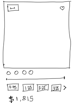
Designed wireframes showcasing various product tile variations for the listing page, followed by a stakeholder discussion to explore options. Subsequently, developed high-fidelity wireframes to facilitate in-house testing for optimal tile selection.
Testing
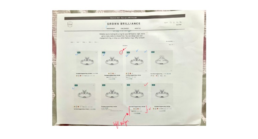
I printed all the options on a listing page wireframe as diffrent tiles and passed it in the office for mu colleagues to vote on which title is the easiest to understand
I presented all the options as different tiles on a printed listing page wireframe and circulated it among my colleagues in the office to vote on the most understandable title.
Final Designs
After soliciting input from colleagues and stakeholders and analyzing their feedback, I refined the product tile wireframe to its final iteration. From there, I proceeded to translate this refined wireframe into the definitive design for the product tile
0.3. Takeaways
Before & After
Impact
- Following the implementation of the new design, sales surged to $15,000 within five days of going live, accompanied by a remarkable 200% increase in conversions.

