
Introduction
Kim’c Market, is a online grocery store, that sells the finest quality of Korean ingredients. This case study focuses on retaining customers and increasing conversion rate.
Problem
Kim’C Market users seek a straightforward method to explore authentic Korean cuisine, yet encounter navigational complexities stemming from unconventional website elements, demanding excessive time and effort to traverse effectively.
Solution
To address the navigational challenges faced by users on Kim’C Market, we propose implementing a streamlined website design with intuitive navigation pathways, clear categorization of products, and user-friendly interface elements. Additionally, incorporating user feedback loops and conducting usability testing will ensure continuous optimization of the platform for enhanced user experience.
Website UX Findings & Recommendations
Project Details
This project aimed to enhance the user experience of Kim’C Market, an online platform offering authentic Korean food products. Through collaborative analysis and stakeholder meetings, we identified navigational challenges and prioritized solutions. By streamlining website elements and conducting iterative design processes, our goal was to create a more intuitive interface for users to explore Korean cuisine effortlessly.
Role
UX / UI Designer
Process
0.1. Discovery
0.2. Ideation
0.3. Design
0.4. Takeaway
Tools
Figma
Miro
Duration
6 weeks
0.1. Discovery
Initial Analysis
For the first part of the discovery process, we took notes on our first impressions and came together as a class to discuss our findings. As a next step, we met with the team at Kim’C Market to go over our initial findings and discuss potential issues together.After our joint discovery meeting, the team categorized the findings into two phases based on priority.
Problem Statement: Kim’C Market users need a simple way to try authentic Korean food, however the website utilizes unconventional elements that take too much time and energy to navigate.


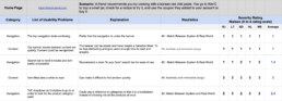
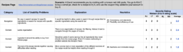
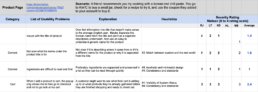
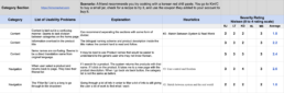
Heuristics Evaluation & Severity Scale
We conducted Heuristics Evaluations & Severity Rating for the different pages of the website.
0.2. Ideation
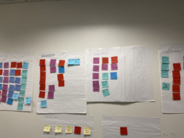
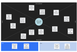
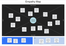
Empathy Map
The team was able to generate three uniquely different types of users based on the client kickoff interview.
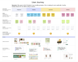
User Journey

Findings
- Prioritize Navigation Clarity: Enhance visual hierarchy in the primary menu to distinguish it from product listings, ensuring users can easily navigate to desired items.
- Optimize Banner Visibility: Reduce visual prominence of banners to avoid distracting from main content, focusing on key information rather than decorative elements.
- Improve Navigation Options: Expand primary navigation to include additional categories like “All Products” and “Specials”, reflecting the breadth of available items and facilitating easier browsing.
- Enhance Product Presentation: Ensure consistency in product photos to accurately showcase items, prioritize clear labeling, and establish a hierarchical structure in product titles for easier identification and readability.
0.3. Takeaway
Conclusion
In conclusion, the challenges faced by Kim’C Market users in navigating the platform to explore authentic Korean cuisine have been met with a strategic solution aimed at enhancing user experience. Through the implementation of a streamlined website design, intuitive navigation pathways, and user-friendly interface elements, we have addressed the complexities hindering efficient traversal of the platform. By incorporating user feedback loops and conducting usability testing, we ensure continuous optimization for sustained improvement. This project not only aimed at improving user experience but also at increasing customer retention and conversion rates, thus contributing to the long-term success of Kim’C Market in providing premium Korean ingredients to its valued customers.